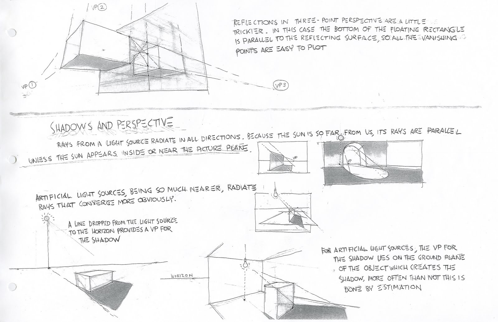
These notes were taken from the underpaintings blog:
LINKFred Fixler: Notes on Drawing (compiled by Norm Nason)General ConceptsLearning the craft of draftsmanship is The Goal we are trying to achieve.
Structural form must be understood.
Drawing is describing form. The importance is not in the finish, but in its veracity (its truth, and accuracy of construction).
You must learn to see, not so much learn to draw.
School studies are not ends; they are means.
Until you can learn to ignore details, you won't learn to draw.
Every device must be employed to carry out accuracy of initial mapping-out of a drawing.
Whatever the form or volume, start with the ideal. Then, compare and modify your ideal to fit the model.
Where the figure rests on something, draw the imprint of the form first.
Anatomy makes it easier to interpret what you see.
Squinting is important in order to reduce the outline to its greatest simplicity. Avoid all those bumps.
Shapes and PatternsLight and shadow in itself produces design.
Light shapes create the image; dark shapes create the pattern and the design. It is light shapes that give form; the dark shapes make the pattern.
Draw dark with one eye and with the other see the light.
Shadow shapes must describe either structure or the form on which it lies.
Lay out form and action first, then indicate the light and shadow pattern.
The shadow pattern may look right, but more often than not it is the light pattern that is wrong.
Turn your drawing upside down and ask yourself how it might be improved. A good, balanced pattern will still look good upside down.
In a drawing, try to keep open or white spaces as part of the design; they provide rest for the eye. Be aware of the positive nature of the paper left untouched. Doing thumbnail sketches will help you to see this. You can do anything with the darks so long as it is accurate where it meets the light.
See two main tones—a light area and a shadow area. Some variation within each. If you squint, you can narrow it down to two basic tones. Separate lights from shadows. Increase the contrast. Make all areas in the light a little lighter than you see them, and all areas in the shadow a little darker than you see them. the lightest light in the shadow is darker than the darkest dark in the light. The object is to make all lighted areas hold together as one group, as should the shadow areas. Otherwise, the subject will not hold together; it will lose validity.
Over modeling comes from incorrect values. One of the quickest ways to correct a problem is to clean up the light and dark areas, simplifying them. Reflected light should never be as light as the main lights. Draw them at least two values darker than anything in the light.
The eye instinctively goes to the light areas in a picture. The real problem is the half-tones: which goes to the light? Which goes to the shadow? Half tones with the light should be made lighter. Those with the shadow should be made darker. Squinting helps here. When it comes to half-tones, when it doubt, leave it out. Make certain that half-tones go around the form. If you don't, your drawing will look two-dimensional.
If two light half-tone passages appear to be equal, squint until one is almost lost to view. Obviously, the one that's almost lost to view is the lighter. Squinting prevents one from being engrossed in detail. It encompasses the total scene. Your drawing, viewed with eyes wide open, should look like the model does with your eyes half shut. Squinting also works with photographs.
Don't overstate highlights—it's a sure way to achieve over-modeling.
Eliminate lines between intercepting cast shadows, like a cat on a skylight.
Cast shadows should explain correctly the forms on which they lie.
When editing drawings at home, it should be a subtractive process: eraser, not pencil.
Eliminate where possible any lines between adjacent light and dark areas.
Consider drawing as a means of containing tone.
Strength in draftsmanship lies in the degree to which structure is depicted.
Make the paper more beautiful with every stroke added. Learn to ignore details, so that you can draw details. Look for the big, basic truths.
Construction is more important than finish.
Light and shade by themselves create design.
The pattern of light makes the drawing, the positive nature of the paper left untouched.
One can do anything with the darks as long as it is accurate where it meets the light.
There are two main tones, that of the light area and that of the shadow area.
Execute your drawing in the fewest possible values. Make certain the half-tones go around the form; get it to turn.
Line and ContourThere are two types of drawing:
Tone subordinated to outline
Outline subordinated to tone
A line is also a tone. If you use a line, make it clear whether it is a line or a tone. Emphasize construction line rather than contour line in the blocking-in of a figure.
Look for rhythmic lines that visually relate the picture or composition and rhythmic lines that create and relate forms. Enhance these effects.
PlanesWhen the light and shade of an object varies in clearly defined areas, it is said to have planes. If light on a form varies with no discernible boundaries, it has no planes; it is rounded. In the light, sometimes things appear too flat. These aren't just arbitrary variations of tone—look at them as planes.
Some forms (spheres, etc.) have no planes. Learn to recognize them.
A change in outline or contour is also a change in plane. Modeling of a surface should be set out in planes of tone, first larger ones, then smaller ones. Good modeling subtly fuses them together.
Gross roundness is characteristic of bad modeling. The most boring thing is a sphere. It does not exist in a human figure.
Try to determine planes that are at right angles to the light. All others will be slightly darker.
Every tone in a drawing represents a plane, facet and sub-facet, ad infinitum.
The degree of finish is a matter of how far you continue breaking down individual planes, probing for details.
Details are easy to see. It's the big form that's most difficult.
EdgesThe edge of a shadow begins where planes of form turn decisively away from the light. Squint!
Determine the edge scale right at the start:
Softest edge
Hardest edge
Big blur or lost edge
All other edges that fall in between
What is the hardest edge inside the figure? What is the hardest edge outside the figure (on the silhouette)? The softest?
Big Blur—the largest area where values on the model and background are similar and where edges between are just as frequently on the light side as on the shadow side.
The degree of finish is the level to which one breaks down planes.
It is the light that will determine the character of the edges. Shadow edges in sunlight, for instance, are very hard. You can almost cut them out with scissors. Contrast this with diffused light. A point source of light (spotlight) has few half-tones and few hard edges.
Edges vary according to:
Conditions of the light
The distance from the viewer (edges become more diffuse and values become lighter the farther away a subject is from the viewer).
The intrinsic sharpness or softness of the object.
Soft edges always give the effect of light, and make things look luminous.
Edges are nearly as important as values. The edge of a shadow begins where planes of the form turn decisively away from the light. Ask yourself before you begin to draw:
What is the hardest edge inside the figure?
What is the hardest edge on the silhouette?
What is the softest edge on the silhouette?
What is the softest edge inside the figure?
Hard edges attract attention and make the form move forward. The best place to use them is within the light areas. The smaller the jump in value, the crisper you can make your edges.
Soft edges—most often exist on the shadow side of the form.
Lost edges—are the softest you can make, mainly on the shadow side.
The big blur—is the largest area in the picture where values on the model and background are similar and where edges between them can be softened or blurred. Edges can be lost in the light as well as in the shadow.
Try to blend or mass adjacent light and dark areas together, eliminating any lines between them wherever possible: a unifying effect. This does not have to mean the elimination of lines around the form, if wanted for delineation or for a decorative effect. Try exaggerating hard or soft edges as you follow shadow shapes.
Look for and create contrasts in value, color and edge.
Halation—the spreading of light around an object (i.e., sunlight coming in through a window sill, where two sharp edges occur and cross each other). Soften the one behind it, especially where they meet. There are only shapes, values and edges.
Go for freedom and looseness through your treatment of edges.
A studied treatment of edges yields the illusion of space. You cannot reduce these principles to a formula. If you look only for shapes and delineation, that's all you'll see. You should also look for softness, merging tones, etc. These are qualities we revere in the really good artists.
Notes on Gouache Painting
by Fred Fixler (edited by Norm Nason)
© 1987 Fred Fixler & Norm Nason. All rights reserved. This text may be freely copied for instructional purposes, but not reproduced for profit.
To begin with, I don't want you people to do anything with edges in your portraits. I want you to start out with the poster look, and work for that without smoothing anything out. I don't like smoothed-out color.
Who can say what color flesh is. It can be any color in the value area of 8 on a scale of 1 to 10, with 1 being black and 10 being white. Flesh is a grayed color, not a pure color. It can be green, it can be blue, it can be anything except a vivid color. For example, if flesh looks gray-blue, it must be a moonlight scene. There is no such thing as a flesh tone.
The first thing I have to teach you is how to take such a flesh tone and go from its lightest light to its darkest dark. Now, I don't mean the colors that come out of the tube, I mean the color that you're using as a flesh tone. As an exercise, take some color from the palette. Mix a "flesh" color, a grayed color of some kind. Then learn to do value studies, taking that color from light to dark in ten equal steps.
As I said, don't use colors straight from the tube. Those are pure colors that you use to mix with. Never use them straight from the tube. Nothing is that color, anyway. Look around the room. Do you see anything that isn't some form of grayed color? Nothing is pure tone. Everything in the room is a grayed version of one color or another. If you never learned anything else in this course—if you left right now—you would have gotten your money's worth knowing that there are no pure colors anywhere.
Sometimes, in commercial work, you'll have a client who says that they want their package to stand out, that it's pure red. So you paint it pure red because they want it that way and againt the other grayed colors. It stands out like a sore thumb, but that's the only incident where such a thing would be done.
Now I know that you're all straining at the bit to get to the portrait work, to do Aunt Minnie's portrait. But people, you have to first learn to take a color and find its darkest value through its lightest value. You must do that as an exercise many times over before you can ever handle the portrait work. Really learn to do that. I know you're all going to argue that a shadow doesn't really go that dark, that it is influenced by reflections and bounce lighting and all that. But that's not what we're talking about here.
Contrary to any belief, you do not make a color lighter by simply adding white. That's the last way to do it. The simplest way to prove it is to take a color and add white to it, then mix more white to it. As you continue to do that it becomes whiter, yes. But it shifts into a cool color. All colors, when white is added, become cooler. You have to compensate for the effect of white and warm the color up with a little yellow or some other light-warm color. Yellow itself is sometimes too light, so you might start with a grayed yellow, to kill the blue. Try yellow ochre.
As I have said, there are no flesh tones. Flesh can be any color: greenish, bluish, reddish, etc. Faces are many colors, in all areas. When you're making value studies from 1 to 10, start with a grayed color and make a consistent value change all the way down the line. If the jump from one value to the other is equal to one half of a tone, then they all have to be oen half of a tone. They must all be the same chroma, and the same hue.
Say we have a tan color (tan is the hue). It's from the yellow family and it's value is from that family. Say it is approximately the eighth value. The chroma is also from the yellow family. Because this is our point of departure, it is the highest intesity of this particular chroma. When you add gray, it becomes very low in chroma, barely identifiable as a color. It's a warm, yellowish color, but very low in chroma. You have to understand these properties of color. Whatever color you pick, all the colors in your value studies must have the same intensity. They must have the same hue, the same chroma, and vary only in value. Say we have a hue of yellow green. You must keep it yellow green, keep the same chroma (the amount of yellow and green). Only vary the value, from lightest to darkest.
In mixing, if you find you have too much chroma, you can reduce it by ading it's compliment or by adding one of the shades of gray we have in our palette. That brings the chroma back into line. Remember, in gouache painting our colors are going to dry a little lighter than they appear when wet.
If you learn to do value studies—practice this patiently, tenaciously—it will greatly facilitate your portrait work. You have to get this first. Really work on it so it becomes second nature.
When you have one of these grayed colors, and you need to cool it, look around for a dirty cool to do it with. Don't go to a pure color, for that will botch things up. And don't make a spectrum that goes from a cool light to a warmer dark. Keep the spectrum all cool, or all warm, consistently throughout the 10 colors you put down. Don't start with a color that is too gray, or too dark.
Learn to do this and your painting will improve one thousand percent, I'll guarantee you. Learn to understand value and progression. For instance, the color on the shadow side of a red box is still red. It doesn't change just because it's in the shadow. In neutral light you'll see that the shadow side of the box is indeed red. Of course, it would be nice to be able to use the Impressionist's colors: reflected light, fill light. But first you have to learn to handle the progression of values.