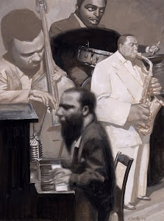
Controlling values is important to create the illusion of realism in a painting. Under the same lighting circumstances a metal object reflects light differently than a piece of cloth. Understanding how this translates into values is important to express the difference in textures.
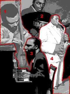
Having no control over your values can cause a painting to fall apart, or lose all sense of depth. In this illustration I did a little experiment. I used my values in an unconventional way, by deviding my illustration into four sections, and apply a different range of values to each section. Within each section, the relative use of values is as usual. The range was set in advance.
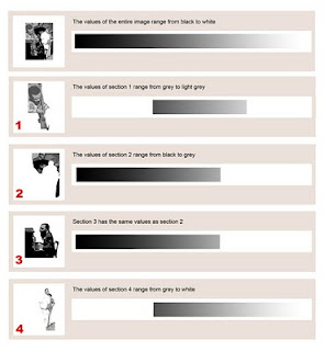
I used the posterise filter, to show how I four basic values for the entire illustration: black, dark grey, light grey and white. When I block in the basic values for an illustration I trie not to go into detail, but stick to only a few basic values. Refinement and detailing come later on.
The use of values this way, gives an unnatural look to the whole of the image. It's as if the different artists have been cut out an put together as a collage. I magnified this effect by reversing the laws of pespective in some areas. Big shapes in the back, small shapes in front.
Setting a limit for the use of values this way is a great exercise to understand and control values. It made me realize what the effect is and made me use values in my other paintings more
consciously.


 Controlling values is important to create the illusion of realism in a painting. Under the same lighting circumstances a metal object reflects light differently than a piece of cloth. Understanding how this translates into values is important to express the difference in textures.
 I used the posterise filter, to show how I four basic values for the entire illustration: black, dark grey, light grey and white. When I block in the basic values for an illustration I trie not to go into detail, but stick to only a few basic values. Refinement and detailing come later on.
 The use of values this way, gives an unnatural look to the whole of the image. It's as if the different artists have been cut out an put together as a collage. I magnified this effect by reversing the laws of pespective in some areas. Big shapes in the back, small shapes in front.
 Mr. Ratzinger...


